Why Doesn't Instagram Add Other Reactions? The Heart is a Product Decision, Not Just a Button
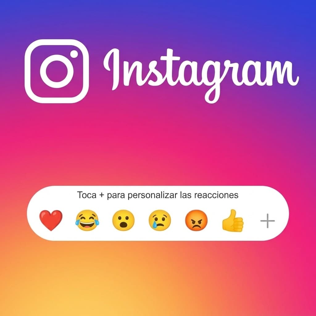
The Heart is Not Just a Button: It's a Product Decision
There is a question that periodically resurfaces among Instagram users:
Why does Facebook have “Like”, “Love”, “Care”, “Haha”, “Wow”, “Sad”, and “Angry”, while Instagram still relies on a single heart as its primary public reaction in the Feed?
At first glance, it seems like an odd decision.
Both platforms belong to Meta. Both feature posts, comments, videos, Stories, and recommendation engines. In fact, Instagram already allows users to express themselves with rich emojis and reactions in other areas of the application.
So why not simply port Facebook's reaction system over to Instagram's Feed?
The most compelling answer is almost certainly not a technical limitation.
It is Product Design.
Instagram does not necessarily need more reactions.
From the perspective of product logic, it needs reacting to be extraordinarily effortless.
And that seemingly subtle distinction completely reshapes how we design the entire user experience.
1. The Meta Paradox
Facebook was one of the mainstream platforms that popularized multi-reactions.
In 2016, Facebook globally rolled out its Reactions system as an extension of the classic Like button. The lineup included:
- ◆👍 Like
- ◆❤️ Love
- ◆😂 Haha
- ◆😮 Wow
- ◆😢 Sad
- ◆😡 Angry
Meta explained at the time that the decision stemmed from user feedback showing that a simple Like failed to capture the full spectrum of emotions people wished to convey across diverse content. To finalize the reaction set, Facebook conducted qualitative research, surveys, and deep data analysis of user comments, stickers, and emoticons.
It made complete sense.
Facebook was conceived as a platform centered around broad social conversations, breaking news, life events, opinion pieces, and personal essays.
A tragic news story calls for sadness.
A controversial political debate sparks anger.
A personal achievement shared by a friend evokes joy.
A surprising scientific discovery triggers awe.
The multi-reaction system provides the nuance necessary to express that context.
Instagram, on the other hand, built much of its core identity around a completely different dynamic:
Imagery. Video. Aesthetics. Discovery. Inspiration. Creators.
That does not imply that everything on Instagram is purely positive, nor does it mean controversial content never exists there.
It means the historical interface of the product was intentionally constructed around a far simpler interaction:
I like this.
And that simplicity carries tremendous product value.
2. Instagram's Heart is an Extraordinarily Efficient Microinteraction
One of Instagram's greatest design triumphs is also one of the easiest to take for granted:
you can Like a post virtually without interrupting your consumption flow.
You are scrolling.
You see something you appreciate.
Double tap.
❤️
You continue scrolling.
You didn't open a popover menu.
You didn't have to read multiple options.
You didn't need to choose between six distinct emotional states.
You didn't switch context.
You didn't need to learn an unfamiliar interaction.
The action is almost seamlessly woven into the natural kinetic motion of the Feed.
That is interaction design.
And it is also a masterclass in reducing friction.
3. Muscle Memory Matters
After millions of repetitions, the double tap stops being a conscious decision.
The user never thinks:
“I want to express approval of this post. Let me locate the corresponding interface element.”
They simply execute it instinctively.
The gesture collapses into an automatic mental link:
content → double tap → heart
This is an immensely powerful characteristic of a mature interface.
When an interaction becomes automated muscle memory, the user can dedicate all of their cognitive attention to the content itself rather than expending energy on navigating the interface.
And that is critical in an application whose primary behavioral mode is rapid content consumption through continuous scrolling.
4. Enter Hick's Law
Hick's Law (the Hick-Hyman Law) states that the time required to make a decision increases logarithmically as the number and complexity of choices increase. In UX, it serves as a cornerstone principle for eliminating unnecessary decisions and streamlining interactions.
It doesn't mean that “more options are inherently bad.”
It means that choices carry a measurable cognitive cost.
Let's compare:
Option A
Double tap → Like
vs.
Option B
Long press → evaluate reaction dock → select emoji → release
The second interaction is completely valid in the right context.
Facebook uses it.
Messenger also uses it for message reactions.
Slack and iMessage rely heavily on it.
However, the contexts are fundamentally different.
Facebook accommodates a more deliberate, conversational interaction because the reaction is part of a larger ongoing dialogue around the post.
Instagram may well determine that introducing that same complexity simply does not justify the cognitive penalty within a fast-scrolling Feed.
5. Friction Isn't Just Physical
When we discuss UX, we frequently think of friction strictly in physical terms:
“How many taps or clicks does this take?”
Yet there is a second, often more consequential form of friction:
cognitive friction.
Imagine coming across a post from a friend who just finished a grueling marathon.
You want to react.
With a single Like:
“I like this.”
Done.
With multiple reactions:
Does this make me laugh? Do I love it? Am I amazed? Am I proud? Which emoji best articulates my exact sentiment?
The second interface compels me to mentally classify my emotion before I can interact.
That classification can be valuable when emotional granularity is the primary objective of the product.
However, it becomes an unnecessary obstacle when the primary objective is to keep discovering and enjoying content seamlessly.
6. The Feed's Goal Isn't to Make You React: It's to Help You Discover Content
This distinction is foundational.
Instagram is not merely a digital gallery of posts.
It is a recommendation engine.
Meta has published extensive technical documentation explaining how Instagram's ranking algorithms leverage hundreds of signals across engagement, relevance, and user behavior to determine what content to prioritize in each user's Feed.
Consequently, the Feed has a broader mission:
to surface content you will find genuinely relevant and maintain a personalized, engaging discovery loop.
The Like is certainly one of the signals used by the system.
But it is far from the only one.
And that reframes the entire question.
We shouldn't ask:
“Why doesn't Instagram want to know if a video made me laugh?”
Rather:
“What information does Instagram actually need to deliver a top-tier recommendation experience?”
7. Instagram Already Has Far More Signals Than Just the Like
In the case of Reels, Meta provides creators with granular telemetry such as total watch time and average watch time to explain exactly how viewers consume their videos.
Moreover, recommendation algorithms incorporate dozens of behavioral indicators.
A user signals strong interest without ever tapping the heart icon:
- ◆pausing to watch a Reel to completion;
- ◆rewatching the video;
- ◆sharing it via external apps;
- ◆sending it to friends via Direct Message;
- ◆writing a comment;
- ◆saving the post to a collection;
- ◆tapping through to view the creator's profile;
- ◆following the account;
- ◆interacting with related topics and hashtags.
In 2025, Meta introduced a dedicated Friends tab inside Reels to highlight content that friends liked, commented on, or reposted—further underscoring that interactions are distributed signals within a much larger discovery ecosystem.
Therefore, claiming that Instagram must introduce “😂” or “😡” simply to feed its algorithm is factually flawed.
The platform already possesses an overwhelming wealth of behavioral data.
8. So Why Does Facebook Have Reactions?
Because reactions solve a communication challenge that is uniquely valuable to Facebook's ecosystem.
When Facebook introduced Reactions, Meta clarified that people sought to express feelings that a standard Like couldn't convey, and that those varied reactions would also inform News Feed ranking algorithms. While initially all reactions were weighted similarly to Likes, Meta subsequently refined how it balanced different sentiment weights.
This reflects clear product intentionality.
Facebook hosts conversational, community-driven content where the specific emotional sentiment forms an integral part of the social discourse.
Instagram extracts the majority of the value it needs through frictionless microinteractions paired with passive behavioral signals.
It doesn't mean one platform is “more advanced” than the other.
It means they are optimizing for completely different human behaviors.
9. Instagram Actually Has Complex Reactions
And here lies one of the most revealing clues in this analysis.
Instagram does not lack expressive reactions.
It has them.
It simply places them where they serve the user best.
Feed
The primary public interaction has historically remained the single Like.
Stories
Stories feature rapid emoji reactions and direct reply prompts, crafted specifically for intimate, ephemeral, and personal micro-interactions.
DMs
In Direct Messages, the paradigm changes completely.
Within a private 1-on-1 or group conversation, reacting with a tailored emoji is natural and expressive. Meta introduced customizable emoji reactions to Instagram DMs during its Messenger integration, later expanding the messaging suite with stickers, GIFs, voice notes, and avatars.
Instants
In 2026, Instagram launched Instants, ephemeral posts shared exclusively with close friends and mutual followers where recipients can react with emojis, submit quick replies, and exchange their own spontaneous photo responses.
This proves the point:
Instagram knows perfectly well how to build expressive reaction systems.
The decision is entirely about where in the product architecture those systems belong.
10. Feed, Stories, and DMs Serve Different Purposes
We can visualize this architectural division:
| Surface | Dominant Interaction | Product Objective |
|---|---|---|
| Feed | ❤️ Like / Double tap | Consumption + content discovery |
| Reels | ❤️ + watch time + sharing | Discovery + entertainment |
| Stories | Quick replies + emoji bursts | Fast, ephemeral social bonding |
| DMs | Emojis + stickers + messaging | Conversational depth |
| Instants | Emojis + instant replies | Intimate, close-circle connection |
| Broadcast Channels | Likes + responses + prompts | Community engagement |
Meta continues to introduce bespoke interaction patterns suited to each unique context. Broadcast channels feature polls and community prompts, while DMs receive richer expressive tools.
This reflects a golden rule of Product Design:
Not every feature should exist on every single screen.
Great product architecture delegates capabilities according to user context.
11. What About Negativity?
Here we explore a compelling behavioral hypothesis.
Consider a reaction like:
😡 Angry
It fulfills an understandable role on Facebook's civic and news-heavy feed.
Now picture that same reaction deployed en masse on Instagram.
A creator publishes a photograph or design portfolio piece.
The public breakdown displays:
- ◆❤️ 12,300
- ◆😂 2,100
- ◆😡 4,700
- ◆😢 900
The post no longer communicates simple social approval.
It now broadcasts a polarized public sentiment breakdown.
While that introduces new data points, it could fundamentally destabilize creator psychology and user behavior.
Important disclaimer: there is no public confirmation from Meta stating that this is *the explicit reason* why Instagram omits negative reactions from the Feed.
However, through the lens of Behavioral Design, it remains a thoroughly plausible factor.
An interface doesn't merely observe behavior.
It shapes and conditions it.
12. What We Measure Shapes What We Produce
Imagine if Instagram introduced five public emotional reactions today.
Over time, creators and publishers would inevitably begin optimizing their content specifically around those emotional levers.
Not just:
“How many Likes did this get?”
Rather:
“How many 😂 reactions did we trigger?” “Why did this design attract so many 😡 reactions?” “What kind of imagery maximizes ❤️ over other reactions?”
Metrics invariably transform into targets (Goodhart's Law).
We already witnessed this phenomenon with traditional Likes.
Meta explicitly acknowledged that public like counts can induce social comparison, anxiety, and pressure, leading both Instagram and Facebook in 2021 to allow users to hide public like counts altogether.
Adding a public emotional spectrum to the Feed wouldn't come free of cost.
It might add detail.
But it would inevitably introduce social friction and psychological weight.
13. Instagram's Design Has Historically Tried to Reduce Metric Pressure
This does not mean Instagram has abandoned engagement metrics.
Far from it.
However, there is a fundamental distinction between:
using a signal internally for algorithmic ranking
and
exposing that signal publicly to every viewer.
Instagram's experiments with hiding like counts were intended to test whether dampening public performance anxiety would foster healthier sharing habits. Meta reported mixed user sentiment: while some found relief in hiding counts, others relied on likes as a barometer for cultural relevance.
From a Product Design standpoint, this reveals an essential tension:
More Feedback
Can deliver:
- ◆richer information;
- ◆nuanced emotional expression;
- ◆greater sense of control;
- ◆refined algorithmic signals.
Yet simultaneously introduces:
- ◆intensified social comparison;
- ◆interface clutter and complexity;
- ◆heightened creator anxiety;
- ◆decision fatigue for viewers.
A designer's craft lies in finding the elegant balance between these competing forces.
14. What About Advertising?
This is often the most cynical explanation suggested:
“Instagram doesn't add reactions because it wants to maximize scrolling speed and ad impressions.”
While tempting, presenting this as an established fact is an oversimplification.
What is factual is that Meta continually tunes its ad delivery and recommendation architectures using vast sequences of behavioral signals.
In 2026, Meta detailed how its modern ad retrieval models utilize organic engagement sequences, dwell time, and user session continuity to enhance ad relevance and performance.
From that, we can formulate a sound design hypothesis:
An ultra-fast, frictionless interaction model aligns naturally with continuous consumption and high-frequency sessions, whereas an interaction requiring users to pause and ponder multiple options introduces friction.
Yet we must maintain intellectual rigor by distinguishing:
design rationale and behavioral hypotheses
from
an officially stated corporate policy.
Meta has never stated:
“We keep reactions off the Feed to cram more ads into user sessions.”
Presenting it as such would be misleading.
15. The Double Tap is a Masterpiece of Interaction Economics
Let's return to the physical gesture.
The most potent quality of Instagram's Like is that it hardly disrupts user momentum.
View post
    ↓
Double tap
    ↓
❤️
    ↓
Continue scrolling
Now contrast that with a multi-reaction workflow:
View post
    ↓
Long press and hold
    ↓
Reaction tray emerges
    ↓
Scan and interpret 6 emojis
    ↓
Select matching sentiment
    ↓
Release finger to confirm
    ↓
Continue scrolling
The difference appears negligible in a single instance.
Multiplied across hundreds of millions of daily sessions, however, it represents a monumental product tradeoff.
Hick's Law illustrates why multiplying alternatives increases decision latency.
And a fundamental product principle applies:
the marginal value of an additional reaction must clearly outweigh the additional friction it introduces.
16. It's Not an Engineering Problem
From an engineering perspective, Meta's infrastructure for multi-reactions is battle-tested.
Facebook supports them globally.
Messenger supports them.
Instagram supports them in DMs.
Instagram supports them across multiple secondary surfaces.
In 2026, we see Instagram rolling out innovative emoji-based feedback across interactive stickers and Instants.
Therefore, the relevant inquiry is never:
“Can their engineers build it?”
Of course they can.
The real question is:
“What does the Feed actually gain if they do?”
And that is a question of Product Management.
17. Every New Feature Carries an Opportunity Cost
Adding a reaction is never merely about dropping in an emoji asset.
It demands designing and maintaining:
- ◆micro-interactions;
- ◆accessibility standards and screen reader descriptions;
- ◆visual states (hover, active, selected, disabled);
- ◆fluid physics animations;
- ◆push and in-app notifications;
- ◆aggregated metrics and counting displays;
- ◆algorithmic ranking weights;
- ◆content moderation and sentiment safety filters;
- ◆data privacy compliance;
- ◆analytics pipelines;
- ◆cross-device compatibility across operating systems;
- ◆user education and onboarding;
- ◆edge-case resolution.
And above all, the foundational question remains:
what core problem does this solve for the user?
If the problem is:
“Users want to express nuanced feelings to creators.”
Instagram already provides Direct Messages, Story replies, and comment sections.
If the problem is:
“We need richer ranking signals.”
Passive behavioral data (watch time, repeat views, saves, shares) already outclasses explicit button presses.
If the problem is:
“Creators need deeper audience insights.”
Professional dashboards already deliver sophisticated analytics.
Thus, the marginal utility of bringing five extra reactions to the public Feed remains exceedingly low.
18. The Summary Matrix
| Surface / Platform | Interaction Friction | Cognitive Load | Interaction Type | Primary Function |
|---|---|---|---|---|
| Instagram Feed | Extremely Low | Extremely Low | ❤️ / Double tap | Rapid consumption + visual discovery |
| Instagram Stories | Low | Low | Quick replies / Emojis | Ephemeral social connection |
| Instagram DMs | Medium | Low | Full emojis, stickers, chat | Conversational depth |
| Instagram Instants | Low | Low | Emojis + photo replies | Close friends spontaneous sharing |
| Facebook Feed | Higher | Higher | Multi-reactions dock | Emotional sentiment in discourse |
| LinkedIn Feed | Higher | Higher | Professional reactions | Career networking & endorsement |
| X (Twitter) | Low | Low | Like + repost + reply | Public conversation & real-time broadcast |
No single row is inherently superior.
Each interface has been fine-tuned for its own distinct combination of:
context + user behavior + product goals.
19. Will Instagram Never Add Other Reactions?
We cannot say with absolute certainty.
Claiming that a product will “never” change is almost always a mistake in tech.
Meta continually iterates on its design systems.
Over recent years, Instagram has evolved its interaction language continuously—from DM expansions and resharing mechanics to Friends feeds in Reels and ephemeral formats like Instants.
If user behaviors or social dynamics evolve, the product may adapt.
An intermediate path is also entirely conceivable:
- ◆celebratory reactions for live events;
- ◆contextual reactions for specific niche formats;
- ◆temporary reaction themes for creator milestones;
- ◆bespoke community reactions inside Broadcast Channels;
- ◆subtle private feedback mechanisms.
In fact, Meta has frequently deployed contextual reactions across its family of apps.
The future of Instagram's interface is unlikely to be a simple photocopy of Facebook's toolbar.
It would be tailored to Instagram's unique aesthetic DNA.
20. The True Lesson of Product Design
Debates surrounding emojis may sound lighthearted on the surface.
Yet they cut straight to the core of digital product architecture:
How many choices does a user actually need?
Any designer can add features.
A great designer knows when not to add them.
More options might seem like more capability.
Yet in reality, they frequently introduce:
- ◆more decisions;
- ◆more visual clutter;
- ◆more interface states;
- ◆more interaction friction;
- ◆more architectural maintenance;
- ◆more cognitive noise;
- ◆less focus on the actual content.
Instagram has historically chosen a deliberate philosophy for its Feed:
an effortless, nearly invisible microinteraction for immediate approval, paired with rich expressive tools distributed where they make contextual sense.
That may not be the only viable paradigm.
Nor is it necessarily perfect for every individual.
Yet there is rigorous intentionality behind the apparent absence.
Conclusion: Instagram Doesn't Necessarily Need More Reactions
The original question was:
Why doesn't Instagram add other reactions?
The most credible answer is not:
“Because Meta doesn't care.”
Nor:
“Because of technical constraints.”
Nor:
“Solely to squeeze in more ad impressions.”
We lack public evidence to substantiate any of those theories as single root causes.
The most coherent evaluation from UX and Product Design is this:
Instagram treats its Feed as a rapid-consumption canvas, where an effortless, zero-friction interaction delivers far greater value than an emotionally complex one.
Facebook found value in expanding the Like because its conversational News Feed required emotional nuance. Meta engineered Reactions specifically to solve that problem.
Instagram, meanwhile, distributed its expressive capabilities according to context:
- ◆❤️ Feed → rapid consumption & frictionless signal
- ◆😂/😍 Stories & secondary surfaces → spontaneous social micro-actions
- ◆😀 DMs → expressive, nuanced private conversation
- ◆💬 Replies & prompts → community building
- ◆📊 Insights → deep creator intelligence
That deliberate separation teaches an invaluable lesson:
Exceptional user experience is not about cramming every conceivable feature onto every single screen.
It is about delivering the right interaction at the exact right moment.
Instagram could add “Love”, “Haha”, “Wow”, or “Angry” tomorrow.
Yet the truly illuminating question for a Product Manager is never:
“Can we build this?”
It is:
“What user problem does this solve, and what interaction friction will it introduce?”
That is where real Product Design begins.
Related Articles
Explore more curated content on SEO, Artificial Intelligence, and Web Development.

Why a Strong Presence Requires unified strategy
Having a website and social profiles is no longer enough to stand out. Learn why a successful digital presence requires combining UX, web development, technical SEO, and digital ads.
Google Ads Policy Issues: How to Fix & Recover Accounts
Learn how to diagnose, resolve, and appeal Google Ads policy violations: from compromised sites and malware to circumventing systems and healthcare restrictions, based on a real-world case study.
Have a project in mind?
I build modern, fast, and SEO-optimized web solutions. Let's talk!